
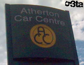
Who: Wakefield Council
Pros: 'I have just finished working for wakefield council,'
spurts ayuplass,'Before I left we were issued with the new headed paper including
our new logo. The logo was displayed proudly at the top as is usual for letterheads
but the A4 sheets included a large water mark based on a section of the logo.
The green part that looks like a spurting cock. Everyone spent Monday running
round saying "Have you seen the new headed notepaper?" My section
head sent a letter to PR saying "Do you realise it looks like a big knob?"'
Cons: It only works if you twist it.
Cock mark: 58%
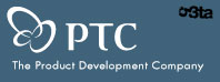
Who: The Product Development Company.
Pros: Nice and abstract. Pleasingly bulky. Proudly errect.
Cons: It's just three circles isn't it?
Cock mark: 42%
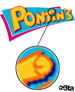
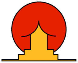
Who: Pontins holiday camp.
Pros: Secret cock in logo of household name shame.
Cons: Unorthodox choice of letter to be so endowed.
Cock mark: 97%
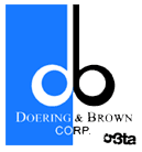
Who: Printing specialists Doering & Brown
Pros: Secret cock. Elegant, gracefully curved testes
Cons: Thin, reedy shaft
Cock mark: 86%

Who: Military uniform supplier
Pros: Ambitious angle - forwards flaccid with emphatic
testicles
Cons: Makes the poor army man look gay
Cock mark: 79%

Who: Engineering consultancy
Pros: A nasty, shrivelled full set of cock and balls
Cons: A bit too arty
Cock mark: 85%
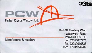
Who: Fitted window company
Pros: "I actually bought a window from these people.
It was very reasonably priced."
Cons: Looks like an action painting of some horrible penis
mutilation.
Cock mark: 94%
And the winner is...
Who: Brazilian Institute for Oriental Studies
Pros: Oh, just look at it.
Cock mark: 100%
Bonus web design award:
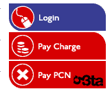
Who: Congestion charge website
Pros: Just look at the top button. Are you that excited about
'logging in'?
Cons: Unrealistic, stringy semen
Exxtra bonus 'muff diver' award

Who: Pride in Oldham award scheme
Pros: Tiny, tiny dwarf man going down on a lady in a peephole
bikini.
Cons: He's starting with her bellybutton.


 Reply With Quote


Bookmarks